Marcel Broodthaers: On Des!!!gn
Eric Li
I have yet to find a convincing definition for graphic design. This is not for lack of trying — I have spent the last several years looking. I know what good design is, yet some actual definition continues to elude me. It is not just a commercial field whose purpose is to create flashy advertisements, nor is it a purely academic practice which speculates the future of visual communication. Perhaps the key trait that differentiates conventional graphic design from so-called “fine art” is its circulation beyond the confines of a museum, gallery, or art collection through various means such as exhibition announcements, commercial packaging, and book design.
For art historian Benjamin Buchloh, these pieces of circulated ephemera exist in “structures of dissemination and distribution that are generally considered mere subproducts—the banal accoutrements to the centrality of the work of art as a substantial object.”1 I would argue that this characterization of graphic design as subordinate to art is misinformed, particularly in a contemporary art context. Graphic design is in fact crucial, if not essential, to the work of Marcel Broodthaers and many that came before and after him. While he was certainly not the first artist to deploy graphic design in his practice — the Dadaists made use of printed matter and ephemera, as did the Russian Constructivists and the Viennese Secessionists before them — Broodthaers’ work stands out in that it strongly relies on the successful execution of graphic design in order to be effective. Marcel Broodthaers’ Museum. Enfants non admis,2 a plastic plaque from his Poèmes industriels series, produced on the occasion of his seminal Musée d’Art Moderne, Département des Aigles, relies heavily on graphic design in order to function the way he intends. In order to convey an aura of authority, this piece reaches into the graphic vernacular of institutional signage, making considered use of certain typefaces, language, and typesetting — traits that a graphic designer may be principally concerned with. In fact, it can be argued that Musée d’Art Moderne, and institutional critique in general, requires a successful execution of graphic design in order to be effective.
Institutional critique, an art movement in which much of Broodthaers’ work is couched, became popularized in the 1960s and 1970s as a direct challenge to “the institution of art with the claim that it was not sufficiently committed to, let alone realizing or fulfilling, the pursuit of publicness that had brought it into being in the first place.”3 Broodthaers’ Musée d’Art Moderne, established in September 1968, comes on the heels of a series of highly charged student protests in May 1968, some in which he participated. Throughout its course, Musée d’Art Moderne raised questions about the relationship between art and the museum as an institution through a series of exhibitions manifesting as sections of a museum. In his most famous manifestation of Musée d’Art Moderne, the Section des Figures presented at the Kunsthalle in Düsseldorf in 1972, Broodthaers exhibited hundreds of disparate objects, all unified under the iconography of an eagle. Buchloh writes, “Many of these objects, borrowed from European museums, were of historical and aesthetic value…others were items of utter banality such as postage stamps, product labels, and champagne bottle corks.”4 This section was pointedly critical of the position of power all art museums maintain in assigning value to particular objects by labeling them as “art;” many of the included objects are also commodities, the relation of which to art was an ongoing interest of Broodthaers. Other sections examine how meaning is produced within specific institutional structures; the museum’s first section examines the furniture of the museum itself.
Section XIXème siècle, created in 1968, was “born, not via concept, but by way of circumstance.”56 It consisted of items used in museum gallery exhibitions such as shipping crates, postcards, ladders, and signs. Several texts refer to how the objects in this section “evoke the museum as their source,”7 with a text published as part of Broodthaers’ recent MoMA retrospective describing the formal invitation card to the opening reception as “requesting guests’ attendance in conservative cursive script and formal, obsequious French.”8 An observation is made here regarding the way the text was set — Broodthaers consciously chooses to typeset the invitation using a “conservative cursive script,” thereby evoking an aesthetic vernacular of institutional elitism and authority. Had the invitation been set using a typewriter font such as Courier, or an International style font such as Helvetica, I doubt that those invited would have found the whole enterprise as convincing. In using a typeface that is often used by aristocrats and elite institutions for their own invitations, Broodthaers is able to deploy the legacy of the typeface and create an invitation that, on its own, functions equivalently to any other museum opening invitation. His use of obsequious French also references the copywriting of such invitations; Broodthaers conscientiously chose oblique wording over straightforward wording in order to effectively emulate a real invitation.
Broodthaers’ considerations in the typesetting of objects found in Musée d’Art continue throughout each section he exhibits, with various typographic deployments contributing an institutional quality to each section. In Section d’Art Moderne, exhibited at the Neue Gallery as part of Documenta 5 in 1972, Broodthaers dedicates a section of a wall in the gallery to wayfinding, a concern in any institution often relegated to graphic design departments. Displayed on four lines, typeset in all caps in a sans-serif typeface, the signage announces different locations in the gallery, with arrows pointing towards their supposed location. Again, Broodthaers consciously typesets the text in order to achieve a desired effect of emulation. A sans-serif face is in line with the tradition of modernism and what one would expect to see in wayfinding throughout a modern art museum. Had he used Times New Roman, the audience would have a completely different reading of the piece, seeing the old-style font as a new piece of work rather than an emulation (and therefore direct critique) of the institution. An older style typeface would appear more clearly a piece of art, no longer asking the audience to question the work in relationship to the larger signage system in which the piece appears. Institutional critique is only effective when it is interpreted as undermining the graphic vernacular of a preexisting institution by redeploying the vernacular against the institution itself — not when it is interpreted as a piece of art.
Through these two examples, we see the usage of typefaces as functional stand-ins for larger entities, namely the institution. This application of a “typeface as a referent” is no different than other artistic devices for symbolism, such as color in the case of Warhol’s Marilyns or more strongly Rauschenberg’s Erased de Kooning Drawing. How a font differs is that it is able to refer to specific entities that have historically deployed the typeface in their own graphic design production and dissemination. Therefore, using a sans-serif font such as Helvetica is not an arbitrary font choice, but a conscious one which considers the font’s entire history, the Swiss International movement’s history, and its considerable deployment in bureaucratic and commercial enterprises as the penultimate “neutral” font. Likewise, the usage of Times New Roman must confront its history as the in-house typeface for The Times, the British newspaper, the default typeface for some number of years in Microsoft’s widespread Word, and the many institutions which rely on it being a serif font in order to achieve a certain aura of authority and authenticity.
The decision to use a specific typeface is just as important as any other artistic decision one makes in producing work. As I’ve described above, the usage of certain typefaces can be much more political due to their inherent historicity and existence far beyond the art world. This makes them, as well as other graphic design strategies, quite crucial artistic tools in institutional critique, where allusions to a preexisting institution or entity are necessary in order for the critique to take place. This is how the traditional notion of graphic design as an “applied” art transforms into an aesthetic one, an art imbued with the same powers to convey political and symbolic meaning as any other form of fine art or institutional critique.
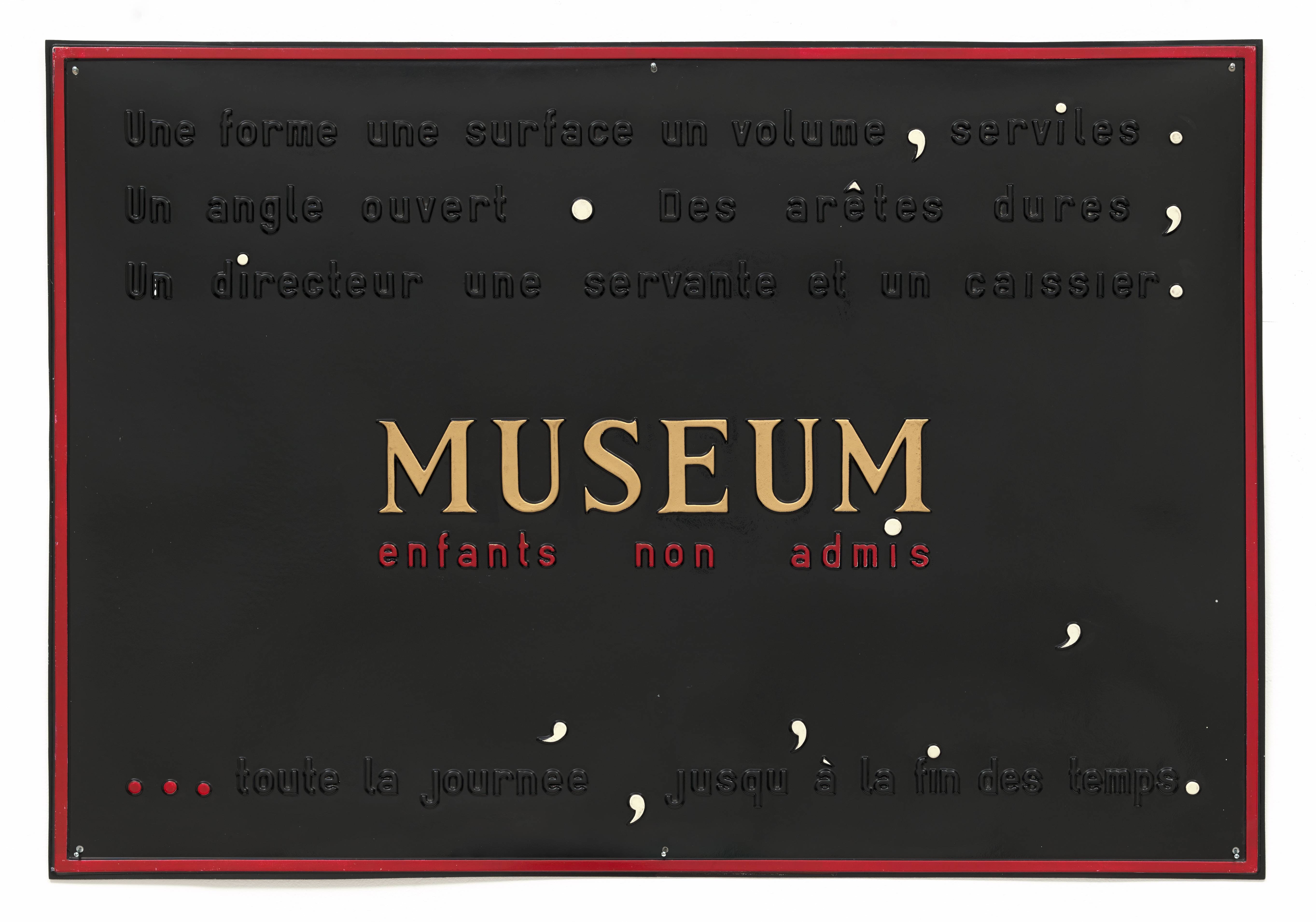
At the same time that Broodthaers was beginning Musée d’Art Moderne, he also started another body of work, Poèmes industriels. Consisting of plaques created from vacuum-formed plastic sheets measuring 85 by 120cm, these objects were created “to look like … advertisements and commercial signs from the period of transition from private manufacture to organized enterprise.”9 Each plaque is formed by heating and then suctioning a single sheet of plastic over a mold of wooden letters and cut-out shapes. Characteristic of each plaque is the juxtaposition of typographic elements with visual elements. While Buchloh writes considerably on the multidimensionality of this body of work in Open Letters, Industrial Poems,10 I want to focus specifically on Museum. Enfants non admis, a plaque that connects his museum with this other body of work, and how it engages with institutional critique on three levels.
Museum. Enfants non admis is actually a pair of plaques – one black and one white. Both contain the same content but are painted differently. On each, Broodthaers has embossed “A form a surface a volume, servile. An open angle. Hard edges, a director a maid and a cashier.” This is followed in the center by the word “Museum” and directly underneath it “Children not admitted.” Below, “…all day, until the end of time.”
In this plaque, Broodthaers brings to light the various staff roles that exist in a museum. In equating them to basic geometric forms often used to describe modernist paintings, he suggests that museums themselves are works of art with which children are in fact not allowed to interact or even enter. This forms a critical look at the museum in terms of both its rigid composition as well as its audience. In the original open letter which was adapted for the plaque, Broodthaers actually states that “people are not admitted,” which begs the question, who exactly is the museum for? Buchloh suggests that “this is a listing of the essentials of the institutionalized and rigidly ordered hierarchical space of avant-garde culture from which life has been banned and has vanished.”11 Visually, this critique is strengthened by the typesetting of “Museum” in all-caps in a foreboding serif typeface that we loosely associate with other institutions of cultural history. The plastic of the plaque gives it an inauthentic aura but nonetheless associates it with an official plaque from a real cultural institution rather than a pretend one. In producing “Museum” this way, Broodthaers parodies the elite cultural institution, in which art is not for everyone, by deploying it as an official plaque in his own museum.
In addition to critiquing the institution of the museum through content, Broodthaers also critiques the larger institution of art and art making through the medium of these plaques. The fact that the plaque refers to an actual metal plaque but is instead plastic is crucial. This, coupled with Broodthaers’ refusal to call the plaques “plaques,” but instead paintings,12 indicates he is actively inserting nontraditional types of work rooted in commodity mass production and advertising into the staid tradition of art. This brings into view the increasing trend of commodification of art through movements like Pop Art. Many of Broodthaers’ printed artworks question the default status of the artwork as a unique object; the plaques are no different. In fact, the plaques were produced in limited editions with the exception of one. This is seemingly in contradiction to the medium in which they exist and are produced, which is an industrial technique that allows for a near unlimited amount to be made without much difficulty. This suggests a skepticism of technology (and its aestheticization)13 as it relates to the “multiple,” a form of “supposedly democratic distribution that spread during the 1960s.”14 The multiple — something that Italian artist and designer Bruno Munari, for example, worked with at length with his Cubo ashtray and Tetracono — functions as the ultimate act of commodification: art objects produced serially so as to be more affordable, but at the expense of uniqueness. Broodthaers chooses to situate Poèmes industriels in this context, where the plaques themselves satisfy the definition of a multiple (they form a series and can be reproduced ad infinitum) but are in fact limited in quantity.
Broodthaers applies a third critique, that of language itself, through his manipulation of form in Museum. Enfants non admis. Through the production of the plaque, Broodthaers transforms the original language of his open letter that the plaque was based on by subjecting certain phrases to aestheticization. “Broodthaers obviously decided that the plaque version required a text whose appearance would seem more devoted to serious reflection on visuality and plasticity than the rather comical conflation of the language of abstract geometric form with the language of administration.”15 This aestheticization of language is compounded by the visual treatment of the body text surrounding the center. Broodthaers purposely left the text the same color as the plastic plate, “which [allows] for a complete integration of typographic and formal elements in one continuous surface, [destroying] the redeeming features of that negative white space that the traditional page format … had to offer.”16 Punctuation marks are visually manipulated through color, translation, and rotation to draw attention away from the text and onto the concrete components of language itself. This objectification can be seen as both a critical view of language itself and its use in commercial advertising. For Walter Benjamin, the deployment of language and meaning-production for commercial purposes was very problematic:
Printing, having found in the book a refuge in which to lead an autonomous existence, is pitilessly dragged out onto the street by advertisements and subjected to the brutal heteronomies of economic chaos. This is the hard schooling of its new form. If centuries ago it began gradually to lie down, passing from the upright inscription to the manuscript resting on sloping desks before finally taking to bed in the printed book, it now begins just as slowly to rise again from the ground. The newspaper is read more in the vertical than in the horizontal plane, while film and advertisement force the printed word entirely into the dictatorial perpendicular.17
Broodthaers, it would seem, shares this critical view of language and its deployment. His plaques allude to the brutal heteronomies and the vertical plane that Benjamin cites. But rather than have the typography of the language exist as is, Broodthaers chooses to pervert its form such that it moves beyond the plane of meaning-giving and into that of visual object and form. In fact, Broodthaers molds language in a way analogous to his definition of culture as “an obedient, malleable matter.”18 His manipulation of form into something beyond language aligns with his own critical stances on the state and uses of language at that time, particularly in politics and within the institution of art.
It was within this “erasure or suspension of reading and the displacement of the literary”19 that many of Broodthaers’ works operated, informed by his past occupations as a journalist and poet. We see this in one of his very first works of visual art, Pense-Bête. Consisting of the last bundle of his last volume of poetry sunk into plaster, Pense-Bête renders language completely inoperable, existing only as a physical object. Another example can be found in Un coup de dés jamais n’abolira le hazard. Based off a poem by Stéphane Mallarmé which “proposed to liberate language from conventions of space and typography by stretching sentences across spreads and using multiple typefaces to abstract both form and content,”20 Broodthaers obliterates language by censoring it completely, replacing the lines of text with black bars.
As seen, Broodthaers is inherently critical of existing structures that correspond to the institution of language — Buchloh writes that his work “insists on the collective historical necessity for [a] ‘new alphabet.’”21 In criticizing language, which is considered a bedrock of culture, Broodthaers also suggests a criticality of the culture in which language operates.
Musée. Enfants non admis serves as an incredibly rich jumping off point in that regard. Through graphic design and commercial processes, it functions as a critical object on three levels simultaneously in terms of form, content, and media, critiquing the commodification and technologicalization of contemporary art itself — not by opposing those actions, but by practicing them. These critical stances are largely achieved through careful graphic design decisions and strategies, particularly typesetting and spatial organization. Consequently, graphic design can and should be considered a fine art medium, no different than painting or sculpture, while still retaining its shared legitimacy as a commercial discipline. Broodthaers’ work shows how important graphic design is to institutional critique — his work could not have been as provocative and radical without it.
I suggested at the beginning of this essay that I have not yet found a convincing definition for graphic design. I think this is because language itself cannot support the various definitions that I’ve ascribed to the term. Maybe the definition I’m seeking doesn’t exist in language, never can, and never will. Maybe we need to invent a new term, a new alphabet, free from the preexisting linguistic baggage, such as des!!!gn or ø/¡!. Until then, Musée. Enfants non admis is the most convincing definition of graphic design yet.
-
Hal Foster et al., Art since 1900 : Modernism, Antimodernism, Postmodernism, ed. Hal Foster and others , Vol. Third edition.New York: Thames & Hudson, 2016). ↩
-
Marcel Broodthaers, “Museum. Children Not Admitted (Museum. Enfants Non Admis),” moma.org/collection/works/146979 ↩
-
Alexander Alberro and Blake Stimson, Institutional Critique : An Anthology of Artists’ Writings, eds. Alexander Alberro and Blake StimsonCambridge, Mass: MIT Press, 2009). ↩
-
Foster et al., Art since 1900 : Modernism, Antimodernism, Postmodernism, ed. Foster and others , Vol. Third edition.New York: Thames & Hudson, 2016). ↩
-
Alberro and Stimson, Institutional Critique : An Anthology of Artists’ Writings, eds. Alberro and StimsonCambridge, Mass: MIT Press, 2009). ↩
-
Broodthaers had ordered several shipping crates to function as seating for a meeting amongst artists and gallery owners to discuss the relationship between art and society; and in doing so realized that these crates were also parts of an art museum. ↩
-
Foster et al., Art since 1900 : Modernism, Antimodernism, Postmodernism, ed. Foster and others , Vol. Third edition.New York: Thames & Hudson, 2016). ↩
-
Marcel Broodthaers, Marcel Broodthaers : A Retrospective / Manuel Borja-Villel, Christophe Cherix ; with Contributions by Benjamin H.D. Buchloh and Ten Others], ed. Manuel J. Borja-Villel and others New York: Museum of Modern Art, 2016). ↩
-
Benjamin Buchloh, “Marcel Broodthaers: Allegories of the Avant-Garde,” Artforum, May, 1980, . ↩
-
Benjamin Buchloh, “Open Letters, Industrial Poems,” October 42 (1987), 67-100. doi:10.2307/778268. jstor.org/stable/778268. ↩
-
Buchloh, “Marcel Broodthaers: Allegories of the Avant-Garde,” Artforum, May, 1980. ↩
-
Buchloh, “Open Letters, Industrial Poems,” October 42 (1987), 67-100. doi:10.2307/778268. jstor.org/stable/778268. ↩
-
Walter Benjamin and his discussion on aura in The Work of Art in the Age of Mechanical Reproduction
function as a really interesting context in which to frame Broodthaers’ skepticism. ↩ -
Buchloh, “Open Letters, Industrial Poems,” October 42 (1987), 67-100. doi:10.2307/778268. jstor.org/stable/778268. ↩
-
Buchloh, “Open Letters, Industrial Poems,” October 42 (1987), 67-100. doi:10.2307/778268. jstor.org/stable/778268. ↩
-
Buchloh, “Open Letters, Industrial Poems,” October 42 (1987), 67-100. doi:10.2307/778268. jstor.org/stable/778268. ↩
-
Cited in Rachel Haidu, The Absence of Work : Marcel Broodthaers, 1964-1976. Cambridge, Mass: MIT Press, 2010). Published in Walter Benjamin, One Way Street and Other Writings, Edmund Jephcott and Kinsgley Shorter, eds., London: NLB, 1979: 62. ↩
-
Marcel Broodthaers, “A Mes Amis,” Museum in Motion, b, . ↩
-
Buchloh, “Open Letters, Industrial Poems,” October 42 (1987), 67-100. doi:10.2307/778268. jstor.org/stable/778268. ↩
-
Marcel Broodthaers, “Un Coup De Dés Jamais N’Abolira Le Hasard (A Throw of the Dice Will Never Abolish Chance),” moma.org/collection/works/146983 ↩
-
Buchloh, “Open Letters, Industrial Poems,” October 42 (1987), 67-100. doi:10.2307/778268. jstor.org/stable/778268. ↩